Recent Brand Identity and Logo Design

This page is the first of two pages showing some of Adamson Design’s Brand Identity and Logo Design work from the last couple of years, starting with the new brand identity for the Office Furniture Centre in Glasgow. This is a flexible identity with 2-line, 3-line, 1-line and stacked versions of the logo, designed to suit different formats and uses. The 2-line and 3-line versions are shown below.

This new Office Furniture Centre logo is the 2-liner version where “Office” appears large and blue in the line above “Furniture Centre”. Logo is a mid-blue circle with an image of a pale blue office chair and bold text reading “Office Furniture Centre” to the right.

This new Office Furniture Centre logo is the 3-liner version where “Office” appears large in the line above “Furniture”, both lines in blue, with “Centre” shown in mid-grey below. Logo is a mid-blue circle with an image of a pale blue office chair and bold text reading “Office Furniture Centre” to the right.

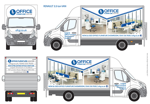
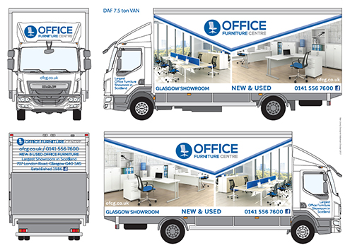
After completing the brand identity and logo design, we created the vehicle livery designs for two sizes of van, the DAF 7.5 ton and the Renault 3.5 ton. Adding large photographs of office furniture to the van-sides meant that the OFC vehicles were acting as mobile billboards as they delivered furniture around the country. The brand identity and vehicle liveries were designed in collaboration with Agata Bochenek.

Pic shows a white Renault 3.5 ton van branded with the new Office Furniture Centre logo. The van-sides show full-colour photos of office furniture in office settings. Logo is a mid-blue circle with an image of a pale blue office chair with text “Office Furniture Centre” to the right.

Pic shows a white DAF 7.5 ton lorry branded with the new Office Furniture Centre logo. The lorry-sides show full-colour photos of office furniture in office settings. Logo is a mid-blue circle with an image of a pale blue office chair with text “Office Furniture Centre” to the right.

Recent Brand Identity and Logo Design – Beauchamp Foods

The Beauchamp bread logo looks like an elliptical plaque. Inside the gold edge, there is a cream background with BEAUCHAMP in navy blue type on a curve at the top. Below, four ears of wheat are shown in front of a orange-red-blue circular glow.

This oval-shaped brand identity was designed ready for use on future packaging for a range of imported French bread. As well as distinctive typography, the central element is an image of four ears of wheat. Designed in collaboration with Agata Bochenek.

See further recent Brand Identity and Logo Designs, link to page 2 below:

Recent Brand Identity and Logo Design 2