Tips on exhibition stand design (1)

Picture shows a four-by-three size exhibition stand I designed for Russell & Russell Accountants. Wider than most exhibition stands, it's a dark blue curved wall with the R&R logo top left, white bulletpoint text in the centre and contact information along the foot. The curved endcap corners have a lighter shade of blue. I'm shown standing in front of the stand in the workshop.

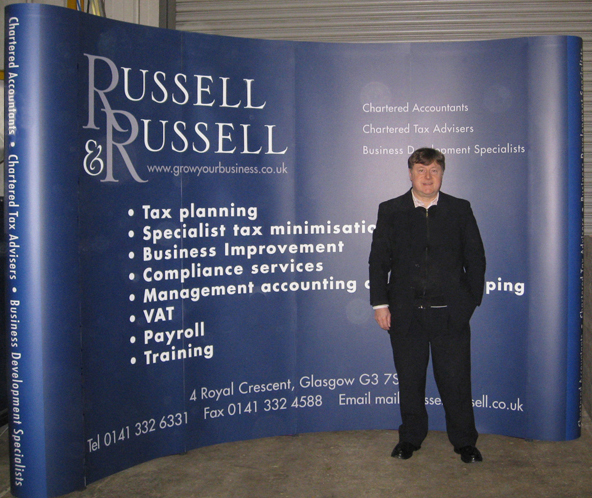
Take a 3-by-3 “curved wall” exhibition stand – from a design point-of-view, don’t look at it as a huge canvas to be covered with lots of images and offers. It will be more powerful with a single message, for example, a single colour or a great photo over the whole wall, with a bold headline, … Read more