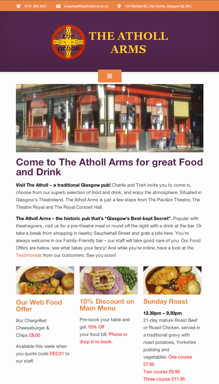
 I was delighted to have the opportunity to create the website design for this well-known, traditional Glasgow pub. Building on the pub’s existing house colours, I designed a web-friendly, responsive website that can be viewed on their customers’ mobiles and tablets. The site – The Atholl’s first website – allows the owners to show their menus, pricelists and their array of food offers. There are pages listing their range of drinks, Malt of the Month, hearty testimonials from their customers, a location map and a blog. The history of The Atholl Arms and the Pavilion Theatre across the road are also covered in fascinating detail. And due to the content management system within the website design, the owners can update the text and pictures as their offers change.
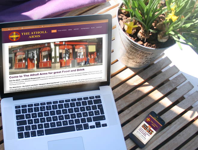
The advantages of mobile-friendly website design to the customer