Take a 3-by-3 “curved wall” exhibition stand – from a design point-of-view, don’t look at it as a huge canvas to be covered with lots of images and offers. It will be more powerful with a single message, for example, a single colour or a great photo over the whole wall, with a bold headline, some bulletpoints and your contact info along the top or near the foot. Cluttering it with secondary sales images and offers will only detract from its visual effect – and the offers will go out-of-date quickly, rendering it obsolete. Only add secondary images and text if they are vital to your main message.
Remember that your sales team will be standing in front of it, so not all pictures and text will always be visible.
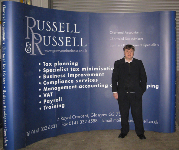
The rounded end caps are a good place to list your services, prospects will see them as they approach your stand from the side, as shown at the extreme left of this picture.
The exhibition designer’s rule is “no small text below the knee, no-one’s going to read it there”. Only contact information should appear below knee-height, often accompanied by your logo.
The photo shows me during a pre-delivery check on the Russell & Russell 4-by-3 stand. You’ll see the contact information appearing “below the knee” is in a very large font size – you have to “Think Big” when designing exhibition stands.